
Wow... two posts on the same day! A bonus! :)
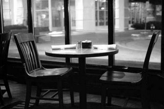
Sometimes simple things can make a strong statement. I shot this simple image with my Fuji S3 while waiting for a bunch of fellow wedding photographers to show up at our quarterly dinner meeting to discuss our work. We help each other out in case there is a need due to illness or just even a need for a second photographer to help at a wedding.
Anyway, using just natural ambient lighting at the restaurant (it was fairly dark in there), I was able to capture a pretty decent shot of a table by the window. The intensity of the lighting outside was obviously more than the lighting inside the restaurant, but it only helps to create the mood of the dark atmosphere in the restaurant.
I took the color image and converted it to B&W. As you can see, it's just as powerful (if not more so) in B&W. By removing the color, the eye is actually more drawn to the main subject (the table and chairs) than the outside background. The point here? B&W can actually help improve an image's effectiveness by taking away the attention being drawn to objects that are in color. In this case, the only thing really interesting to look at in the B&W shot is the table and chairs... which is the main subject.
What are your thoughts on this? Comments welcomed!
11 comments:
I like them both, but black and white has a more photojournalistic look to it.
I like the color version better. When I take a picture the background light always blows out the picture because it is too bright. How do you keep this from happening?
Thanks for the comments.
To keep the background from "blowing out" you have to expose the image for the background, not the foreground. This could make the foreground image too dark, in which case a flash set for no brighter than the exposure of the background is needed to "fill-in" the foreground image with more light. In the case of these tables, no fill light was added so the foreground maintained a darker feel, adding to the ambience of the restaurant's low lighting.
I like the B&W.
Another vote for the Black & White version.
One more vote for the B&W.
I don't know, I like them both... but I'm leaning towards the color one more.
How do you get the pictures to look so good without using a flash?
Kathy
Kathy:
High ISO and a very fast lens! Usually I set my S3 for ISO 1600 when lighting is really low in the venue. All of my lens open up to at least f 2.8 (except the Nikon 12-24mm f 4.0 DX lens). I have two lenses that open up to f 1.4!
So a combination of a fast lens and high ISO will ensure a faster shutter speed which is necessary to avoid blurring the image from camera shake.
I often use Aperture Priority mode on my cameras and let the camera decide on the proper exposure. At times though, I will take a handheld meter reading of the ambient light falling on a subject (incident meter reading) rather than a reflected meter reading from the camera. This can help determine the proper exposure.
If these tables stay empty much longer, the restaurant is going to go out of business. I’ll vote for the B&W, only that I’m an old guy and that’s what I was brought up with. B&W has more imagination to it. Looks like someone made a date, and no-one showed. Now that brings back memories.
Chris
Yeah... blind date! :)
Sometimes when I meet new potential clients at Starbucks, I wonder if they will show up or not. I've been stood up a couple of times, but for the most part, most people have the courtesy to show up. But I did have one couple recently who did stand me up. I waited for 1/2 hour and was ready to just pack up and go home, but then another bride I had met the week before called me on my cell phone and told me that she was booking me! So, it wasn't a total loss!
Russ
Good recovery, Russ!
Chris
Post a Comment